When I first visited the Milwaukee Neighborhood News Service, the first thought that popped into my head was, "That is a lot of Syracuse Orange!" Once I got over the athletic implications of the color scheme, I was incredibly impressed with the layout and content that MNNS publishes. It was organized in manner that is an easy to navigate.
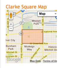
| My favorite navigation option was the Neighborhood section. For someone who is not from the Milwaukee area, I do not really know where any of these neighborhoods are located within the city. Having the maps on the sidebar are really helpful and add a unique twist to a classic sidebar. The maps made it easier for me to see if the neighborhoods are close to other landmarks that I know. |
Each neighborhood page is also equipped with a history specific to the neighborhood, which is informative and engaging for readers. While most readers might be coming to the site for a specific story, this history will add a tremendous amount to their overall experience because it gives them a back story that they can now link back to the story they originally came for.
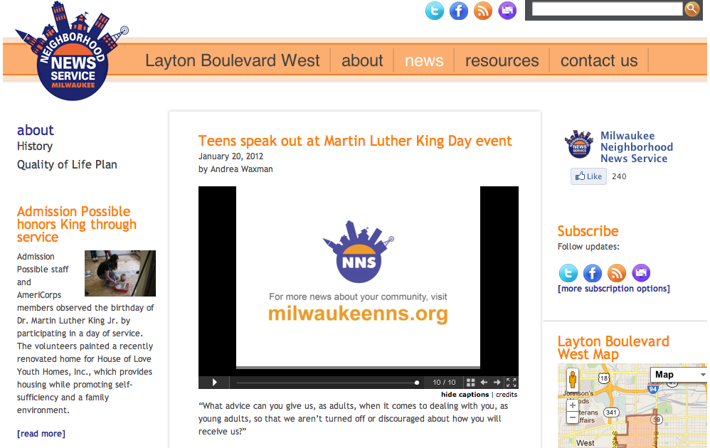
In looking at most of the articles and pieces on the website, I found that the coverage was very unbiased, which is rare in the news industry. It was all about the information. There was no opinions inserted or agendas pushed. It was very effective journalism. Looking at the recent article on teens speaking out about problems they see with education on Martin Luther King, Jr. Day, this had the potential to go drastically wrong because of the subject matter. Instead, it presented the facts without bias and let the reader make up his or her mind.
In looking at most of the articles and pieces on the website, I found that the coverage was very unbiased, which is rare in the news industry. It was all about the information. There was no opinions inserted or agendas pushed. It was very effective journalism. Looking at the recent article on teens speaking out about problems they see with education on Martin Luther King, Jr. Day, this had the potential to go drastically wrong because of the subject matter. Instead, it presented the facts without bias and let the reader make up his or her mind.
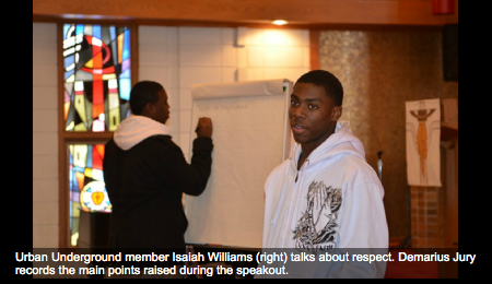
There are two things the Milwaukee Neighborhood News Service could improve on. The photo slideshows are very powerful and bring the audience to the event, but they could be more effective with audio. I understand sometimes audio is not able to be used, but hearing from those students that passionately engaged with administrators about education, would make the piece tremendously more effective.
The second thing that really glared at me was the use of white space. Especially towards the bottom of the home page and on the right side, there seems to be an overwhelming amount of white space. That can indicate to some readers that there might not be enough content to fill up the home page. I do not believe this is correct, but some readers might interpret it that way.
The second thing that really glared at me was the use of white space. Especially towards the bottom of the home page and on the right side, there seems to be an overwhelming amount of white space. That can indicate to some readers that there might not be enough content to fill up the home page. I do not believe this is correct, but some readers might interpret it that way.
The Neighborhood News Service is already something great, but has a lot of potential to be something even better. The relationship with Marquette University is highlighted on the About Us page and falls within the Jesuit ideals of being greatly involved in the community. This relationship will not only benefit the News Service, but Diederich College of Communication students as well.
